[identity profile] noluck-boston.livejournal.com posting in [community profile] vintageads
Today's battle is between dinning spaces.

Put your interior design hat on and lets hear your comments.

Which would you choose?
What do you like?
What would you change?

Check back tomorrow as we will have a battle of the Fireplace/Living room spaces.


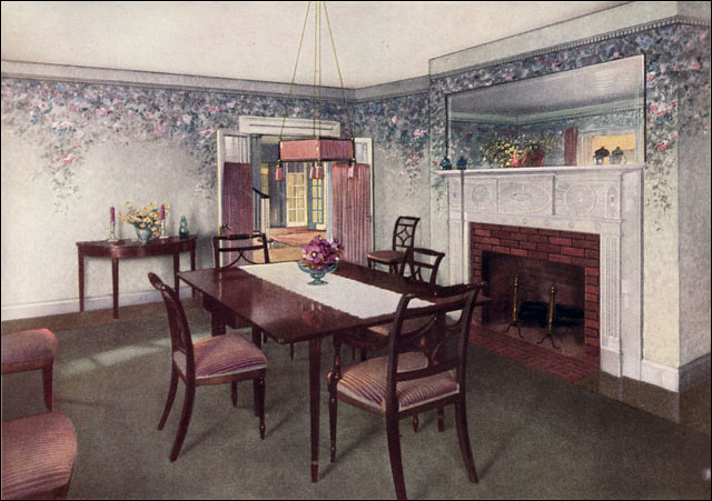
1.) 1925 Wallpaper Ad
1925 Wallpaper Ad - Dining Room


2.) 1953 Modern Ranch Window Treatments Ad
1950s Modern Ranch Window Treatments

Date: 2015-03-23 01:21 pm (UTC)
From: [identity profile] memnet.livejournal.com
I like #1; the walls, fireplace/mantle, and the furniture are lovely. I would have a larger table on the one wall since to me, the small table seems a bit lost.

I like all the windows and wood in #2; the furniture not so much.

I'd choose #1.

Edited
Edited Date: 2015-03-23 01:24 pm (UTC)

Date: 2015-03-23 01:41 pm (UTC)
bradygirl_12: (yellow roses)
From: [personal profile] bradygirl_12
Wow, the wallpaper really sells #1! Beautiful.

I do love the open spaces for #2.

Date: 2015-03-23 01:43 pm (UTC)
From: [identity profile] baron-waste.livejournal.com
Well, #2 seems like it would require nuclear-powered air conditioning, but I see how they've put a high vaulted ceiling up where the greenhouse-hot air can collect and hopefully be vented out.

I differ with [livejournal.com profile] memnet on the furniture in #1; I remember those chairs, they were ghastly.  (Not only were they not overly comfortable, they creaked ominously with every movement.)  Otherwise, yah, I'd go with #1, because I'd feel every minute like the neighbors were watching my every move through those giant windows.

Date: 2015-03-23 02:46 pm (UTC)
From: [identity profile] percysowner.livejournal.com
Definitely #1. 2 would be a nightmare to cool and feels really exposed. Plus I like the fireplace. The wallpaper is nice as well.

Date: 2015-03-23 04:22 pm (UTC)
From: [identity profile] spikesgirl58.livejournal.com
Definitely the second one. I like the colors, the airy feeling and things look comfortable and fun.

Date: 2015-03-23 04:30 pm (UTC)
pronker: tala the sorceress from phantom stranger comics (Default)
From: [personal profile] pronker
#1 is nicely furnished, and would need a light wallpaper or a great deal of incoming light to make it not too glum. I see that off-stage to the left is a window's light on the carpet, so that's good. Love the mirror over the fireplace, which at first seemed a little trompe-l'oeil to make an illogical shelf!

#2 would be glorious on sunny days, perhaps a little exposing on stormy ones? I might run away if it were rainy and windy! but I like the table chairs a lot. Nice tulip-y outline.

Date: 2015-03-23 05:13 pm (UTC)
misstia: (Default)
From: [personal profile] misstia
i love everything in #1...wouldn't change a thing!!

Mix and match?

Date: 2015-03-24 02:53 am (UTC)
From: [identity profile] heather mccrillis (from livejournal.com)
I want #1's room (because the windows in #2 would make my house cold as fuck.) and #2's furniture for the same reasons baron_waste does.

Date: 2015-03-24 04:29 am (UTC)
dandyads: (raptor)
From: [personal profile] dandyads
I do not see a single thing in #1 that I like - if that were my place: gut renovation!

Not crazy about the dark wood in #2 but otherwise I like that one - lots of sunlight for sure, but i'd probably put in a couple (dozen) privacy hedges outside.

Date: 2015-03-24 04:45 am (UTC)
From: [identity profile] ejia-arath03.livejournal.com
The walls in #1 are hideous. If they were plain white, or cream, I would like them much better. The furniture looks nice and elegant, but I am not sure of the comfort factor.

The natural light and giant windows in #2 are fantastic, but the furniture is not. I also hate the ceiling.

Overall, with new walls, I would pick #1.

Date: 2015-03-24 06:37 am (UTC)
From: [identity profile] baron-waste.livejournal.com
Y' know, I thought about that later: That wallpaper looks like it's designed to cover up dirt, which in effect means the walls always look grimy.  In a room with a fireplace it's particularly unfortunate.

“You guys really need to get a chimneysweep in here.”

“No, we DON'T.”

Date: 2015-03-24 05:30 am (UTC)
From: [identity profile] luke-russell.livejournal.com
#1 Chandelier would be a horrible dust catcher. Uggh. #2 is bright and airy but is so out of date it is also unappealing. I guess I choose #2.

Date: 2015-03-24 07:43 am (UTC)
From: [identity profile] vilakins.livejournal.com
#2 all the way! I'd go for that pretty much as is.

Date: 2015-03-24 09:54 am (UTC)
From: [identity profile] shortsweetcynic.livejournal.com
#2, by far. so gorgeous.

Date: 2015-03-24 05:07 pm (UTC)
From: [identity profile] almond-cakes.livejournal.com
For everyday living, #1. For temporary stay/vacation in a sunny clime, #2 would be nice.

Date: 2015-03-24 07:26 pm (UTC)
From: [identity profile] thremma.livejournal.com
Oh, I like battles of the rooms. I like #1 best overall; the wallpaper is lovely and I like the fireplace and colored rug. #2 is too much brown and too angular. But a combination, with the lots of windows from 2, the wall paper (on the walls that have it) from #1,the chairs from 2, the table from 1 would be very nice.

Date: 2015-03-25 03:13 pm (UTC)
From: [identity profile] fflo.livejournal.com
#2 -- the shadows! Ahhhh.

I'd change the table and chairs for something unupholstered.

"Upholstery" is a weird word. Let's visit its etymology, via http://etymonline.com:


upholsterer (n.)
"tradesman who finishes or repairs articles of furniture" (1610s), from upholdester (early 15c.; early 14c. as a surname), formed with diminutive (originally fem.) suffix -ster + obsolete Middle English noun upholder "dealer in small goods" (c.1300), from upholden "to repair, uphold, keep from falling or sinking" (in this case, by stuffing); see uphold (v.).


Profile

vintageads: (Default)
Vintage Ads

October 2025

S M T W T F S
   1234
567891011
12131415161718
19202122232425
2627 28293031 

Most Popular Tags

Style Credit

Expand Cut Tags

No cut tags
Page generated Apr. 4th, 2026 11:36 pm
Powered by Dreamwidth Studios