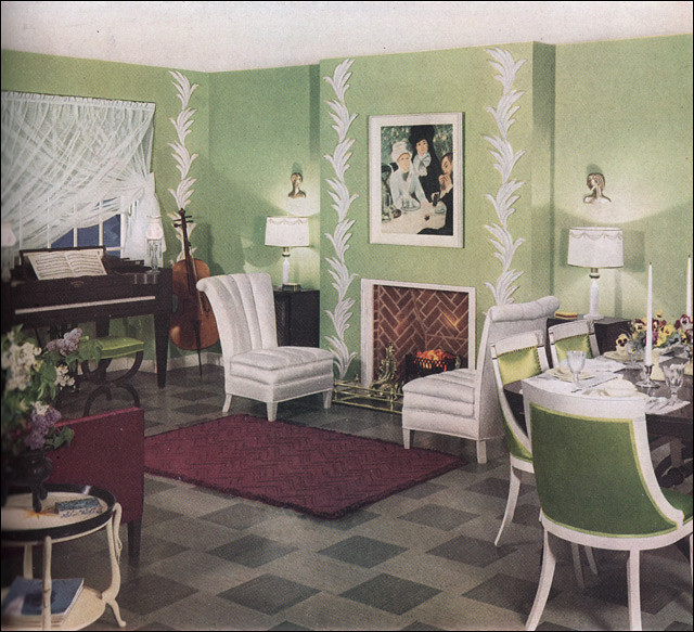
Agreed that I love the colors from #1, but prefer #2's aesthetic. I don't think either of them would be good as a living room, though- I'd love to have a smaller version of #2 as an office, and #1 strikes me as more a "parlor" than a living room.
I'm not really keen on either of them, but of the two options, I'd go with #2.
#1 just looks like one of those living rooms you're just supposed to look at and not actually use. It also reminds me of the 'hotel room' that Dave Bowman was in at the end of 2001: A Space Odyssey.
I'll take the first one just because the overall effect is less busy/obviously 'decorated'. Fussy over use of plants and objets irritate me in a visceral way. I'd rather look at old fashioned organic clutter if it comes to that.
The only thing I like about #2 is that it has a TV set, but if I'm living in 1936 I won't miss it! I will just sit by the fire and listen to cello sonatas.
#2's floor I like, but there's a feeling of too much going on in there? So, #1, because I like the colors (except of the floor; now, if they'd used a variant of the second floor pattern for the first room (light and dark green, or even plain white/patterned white, if they wanted to keep the focus on the walls?) it would be perfect--or, even a dark wooden floor in #1 might work? I do love looking at these, and thinking about variations (or, with the WOW bathrooms, just going, "Wow! There is not enough room in my house for that bathroom!)
I think the side of the couch is the red arm on whatever faces the fireplace. You just can't see the whole couch. It seems as if one would fit that space in any case.
what is that kind of white accent piece in #1 called? the filigree running up the walls? it's on the tip of my tongue, but for the life of me i cannot remember.
#1 for me, but I'd find better curtains. I do love the colors in #1 and it feels less cramped. I hate the floor on #2. For 1936 you don't need a TV. For today, you can put the TV on a mount over the fireplace.
I know right? The white chairs look ok, but who wants to sit on white freaking chairs and possibly get them smudged? And those dining room ones look uncomfortable.
I want both! :D I really like the elegant style of room #1 (I'd change the paint color, though) and the bookcase/desk/entertainment area in room #2. One can be the livingroom... the other, the fancy home office

no subject
Date: 2013-06-13 02:51 pm (UTC)no subject
Date: 2013-06-13 02:54 pm (UTC)no subject
Date: 2013-06-13 02:58 pm (UTC)no subject
Date: 2013-06-13 03:16 pm (UTC)#1 just looks like one of those living rooms you're just supposed to look at and not actually use. It also reminds me of the 'hotel room' that Dave Bowman was in at the end of 2001: A Space Odyssey.
no subject
Date: 2013-06-13 03:33 pm (UTC)no subject
Date: 2013-06-13 03:52 pm (UTC)no subject
Date: 2013-06-13 04:19 pm (UTC)no subject
Date: 2013-06-13 04:15 pm (UTC)no subject
Date: 2013-06-13 04:21 pm (UTC)no subject
Date: 2013-06-13 04:25 pm (UTC)no subject
Date: 2013-06-13 05:18 pm (UTC)no subject
Date: 2013-06-13 05:40 pm (UTC)#1 for me!
no subject
Date: 2013-06-13 06:47 pm (UTC)no subject
Date: 2013-06-13 07:44 pm (UTC)no subject
Date: 2013-06-13 08:02 pm (UTC)no subject
Date: 2013-06-13 09:54 pm (UTC)no subject
Date: 2013-06-13 11:58 pm (UTC)no subject
Date: 2013-06-14 02:45 am (UTC)no subject
Date: 2013-06-14 12:25 am (UTC)no subject
Date: 2013-06-14 01:28 am (UTC)no subject
Date: 2013-06-14 02:42 am (UTC)no subject
Date: 2013-06-14 02:55 am (UTC)no subject
Date: 2013-06-14 10:40 pm (UTC)no subject
Date: 2013-06-14 11:22 pm (UTC)no subject
Date: 2013-06-15 10:43 am (UTC)no subject
Date: 2013-06-16 01:17 pm (UTC)